
Exploring Lynx Js Accessibility: Semantic Custom Native Element
What is Lynx?
Recently TikTok’s parent company, Bytedance, released Lynx as open source. Lynx is a family of technologies that allowed us to use web development skills to create native UIs for both mobile and web from a single codebase. Basically, Lynx has two big parts: the UI that written using markup, CSS, and JavaScript, and the engine that need to be integrated to the mobile or web apps, that will render and run the UI.
Based on the documentation when this article is written, lynx has these tags built-in:
<view><text><image><scroll-view><list>,<list-item>
With these elements combined with styling using CSS, we can create pretty much anything for our UI.
Familiarity with Lynx
Personally, I already familiar with lynx because I worked on Tokopedia and TikTok Shop integration project. I was only worked and explored on the frontend implementation, but not the native app side. Now that Lynx become open source, I want to explore the native side implementation, the part that actually process lynx UI code and renders it to the screen. Honestly, I’m actually not that familiar with native android app development. The last time I learn it is when still in college circa 2016. now, my curiosity forced me to re-learn this again in 2025.
Accessibility in Lynx
In web development, I already familiar with WCAG and how to make a web app more accessible and inclusive (still far from expert, though), and usually I tried to implement it in every project I worked on. Like how to use the right semantic tags and aria attributes. But, in Lynx things are different. the tags and the attributes are different.
There are some attributes that can enhance accessibility in Lynx. for example:
| Attribute | Description |
|---|---|
| accessibility-element | Boolean. Make the element to be included in accessibility tree. <image> and <text> are true by default. |
| accessibility-label | String. Assign label to the element |
| accessibility-trait | String. the value is none by default for <view>. possible value: none, button, image, text |
For more available attributes, see Lynx accessibility documentation.
But, wait! After exploring the auto-complete and source code, I also found out there’s more attributes that is not listed (yet) in the documentation. For example:
| Attribute | Description |
|---|---|
| accessibility-trait | support more semantic elements: text, image, button, link, header, search, selected, playable, keyboard, summary, disabled, updating, adjustable, and tabbar |
| accessibility-heading | mark the element as heading |
| accessibility-role-description | possible values based on the type definition: switch, checkbox, image, progressbar, and string; |
For more attributes, see available accessibility attributes in the code. With those attributes, we can enhance our app’s accessibility. for example:
<view
  className='radio-button'
  accessibility-element
  accessibility-role-description='radio button'
  accessibility-label='Option 1'
>
  <view className='radio-button-circle' />
  <text accessibility-element={false}>Option 1</text>
</view>
In this implementation, some accessibility feature is missing. Like disabled state and “double tap to activate” that sound like native app. this is what inspiring me to explore native side implementation and write this post.
Creating Custom Accessible Element
Yes, Lynx has a limited built-in elements. But, it also have powerful feature to create a custom native element. We can use this to make a more accessible radio button. First, I want to use the accessibility elements to be just a wrapper for existing components. So, if there is an existing design system and component, I can just wrap them.
Create A Proof of Concept
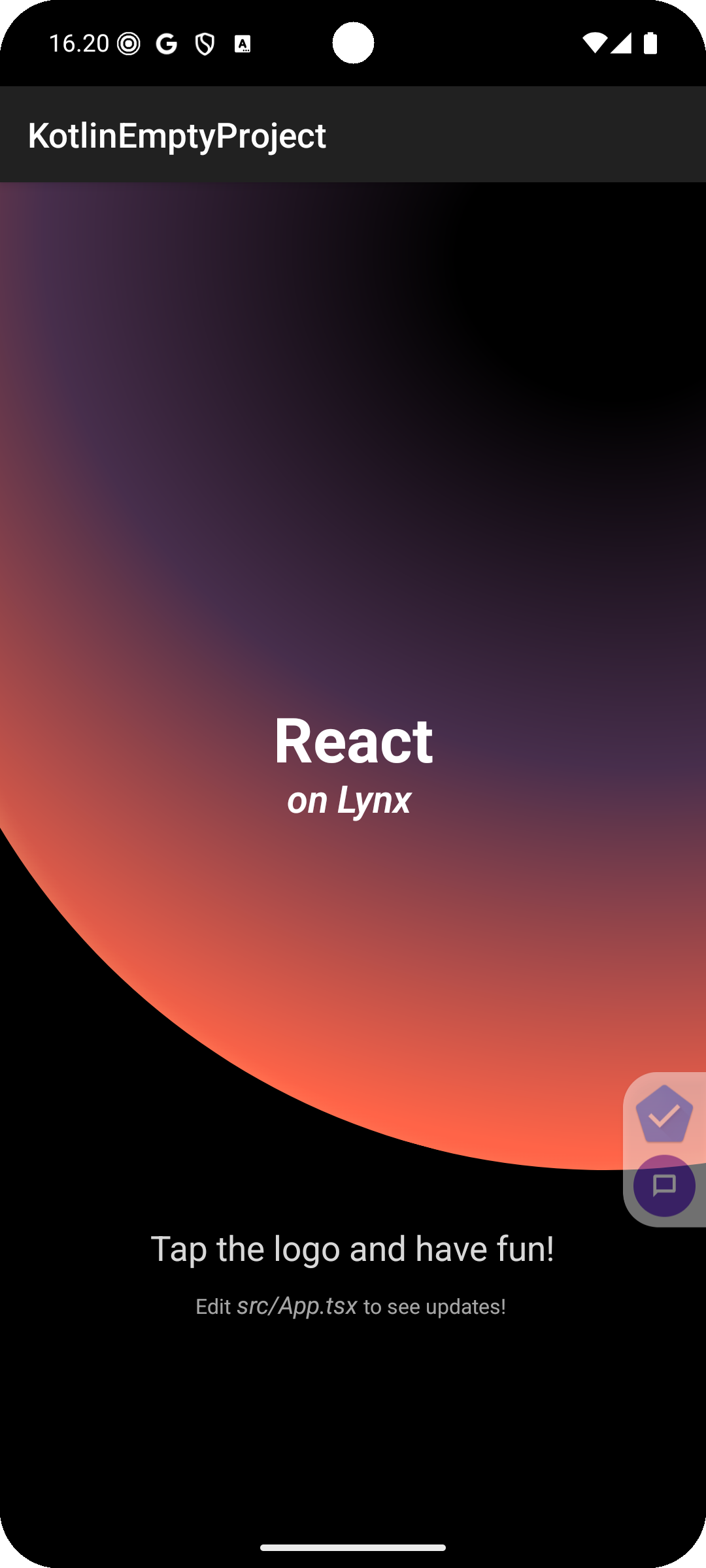
First things first, let’s create a simple project to run Lynx in an android app. We can use Lynx Quick Start Tutorial and Integrating Lynx with Existing App Tutorial from Lynx documentation.

The images seems failed to load. We can ignore this issue for now. Let’s create a proof of concept for simple view that can wrap other views.
// PlainView.kt

package com.nurulirfan.lynx.accessibilityelements

import android.content.Context
import com.lynx.tasm.behavior.LynxContext
import com.lynx.tasm.behavior.ui.view.AndroidView
import com.lynx.tasm.behavior.ui.view.UISimpleView


class PlainView(context: LynxContext) : UISimpleView<AndroidView>(context) {
    override fun createView(context: Context?): AndroidView {
        return AndroidView(context).apply {

        }
    }

    override fun onLayoutUpdated() {
        super.onLayoutUpdated()
        val paddingTop = mPaddingTop + mBorderTopWidth
        val paddingBottom = mPaddingBottom + mBorderBottomWidth
        val paddingLeft = mPaddingLeft + mBorderLeftWidth
        val paddingRight = mPaddingRight + mBorderRightWidth
        mView.setPadding(paddingLeft, paddingTop, paddingRight, paddingBottom)
    }
}
Let’s register it in YourApplication.kt file:
 // YourApplication.kt

 ...
 import com.lynx.tasm.LynxEnv
+import com.nurulirfan.lynx.accessibilityelements.PlainView

 class YourApplication : Application() {
     ...

     private fun initLynxEnv() {
+        LynxEnv.inst().addBehavior(object : Behavior("plain-view") {
+            override fun createUI(context: LynxContext): PlainView {
+                return PlainView(context)
+            }
+        })

         LynxEnv.inst().init(
             this,
             null,
             null,
             null
         )
     }
 }
Now, we can use the element
...
<plain-view>
  <text className='Title'>React</text>
</plain-view>
...
The result looks ok. the <plain-view>’s children is rendered successfully. let’s make a Radio Button.
Create Custom Radio Button
Let’s make a simple radio button component in Lynx JS first.
// RadioButton.tsx

import './styles.css';

interface RadioButtonProps {
  checked: boolean;
  text: string;
  onChecked: () => void;
}

export const RadioButton = ({ checked, text, onChecked }: RadioButtonProps) => {
  return (
    <view
      style={{ display: 'flex', flexDirection: 'row', alignItems: 'center' }}
      bindtap={() => onChecked()}
    >
      <view className='radio'>
        <view className={`radio-inner ${checked ? 'filled' : ''}`} />
      </view>
      <view>
        <text className='text'>
          {text}
        </text>
      </view>
    </view>
  )
}
/* styles.css */

.radio {
  margin: 0 8px 0 0;
  height: 24px;
  width: 24px;
  border-radius: 50%;
  border: 0.2rem solid teal;
  padding: 4px;
  background-color: transparent;
}

.radio-inner {
  height: 100%;
  width: 100%;
  background-color: transparent;
  border-radius: 50%;
}

.filled {
  background-color: teal;
}

.text {
  font-size: 1rem;
}
And then use the component
// App.tsx

import { useState } from '@lynx-js/react'

import { RadioButton } from './components/RadioButton/index.jsx'
import './App.scss'

const ICE_OPTIONS = [
  { id: 'less', text: 'Less Ice' },
  { id: 'normal', text: 'Normal' },
];

export function App() {
  const [iceLevel, setIceLevel] = useState('');

  return (
    <view>
      <view className='Background' />
      <view className='App'>
        <view className='Banner'>
          <view className="card">
            <view className='card-title'>
              <text accessibility-heading>Detail Order</text>
            </view>
            <view className='card-body'>
              <view className='sub-title'>
                <text accessibility-heading>Ice Level</text>
              </view>
              <view className='sub-body'>
                {ICE_OPTIONS.map((option) => (
                  <view className='option' key={option.id}>
                    <RadioButton
                      checked={iceLevel === option.id}
                      text={option.text}
                      onChecked={() => setIceLevel(option.id)}
                    />
                  </view>
                ))}
              </view>
            </view>
          </view>
        </view>
      </view>
    </view>
  )
}
Here is how it looks and how it sounds when accessed using screen reader (Talk Back)
Notice that the radio buttons doesn’t have any information beside the text label. From what I understand from learning WCAG and testing using screen reader like Voice Over and Talk Back, to make an element accessible using, the element need to have name, role, and value (WCAG 2.1 Success Criteria 4.1.2).
For a radio button we need:
- name or label: text value of the radio button, e.g. “Less Ice”
- role, what type of the element: radio button
- value:
- checked / not checked
- enabled / disabled
Now, let’s jump into the code.
1. Create RadioButton Class
Let’s create RadioButton class based on the previous POC PlainView class. For radio button, we will add some default properties like isClickable, isFocusable, etc.
// RadioButton.kt

package com.nurulirfan.lynx.accessibilityelements

import android.content.Context
import android.view.View
import com.lynx.tasm.behavior.LynxContext
import com.lynx.tasm.behavior.ui.view.AndroidView
import com.lynx.tasm.behavior.ui.view.UISimpleView

class RadioButton(context: LynxContext) : UISimpleView<AndroidView>(context) {
    var mText: String = ""
    var mChecked: Boolean = false
    var mDisabled: Boolean = false

    override fun createView(context: Context?): AndroidView {
        return AndroidView(context).apply {
            isClickable = true
            isFocusable = true
            importantForAccessibility = View.IMPORTANT_FOR_ACCESSIBILITY_YES
        }
    }

    override fun onLayoutUpdated() {
        super.onLayoutUpdated()
        val paddingTop = mPaddingTop + mBorderTopWidth
        val paddingBottom = mPaddingBottom + mBorderBottomWidth
        val paddingLeft = mPaddingLeft + mBorderLeftWidth
        val paddingRight = mPaddingRight + mBorderRightWidth
        mView.setPadding(paddingLeft, paddingTop, paddingRight, paddingBottom)
    }
}
2. Add Click Listener
Now, add click listener and handle some cases.
- For disabled state, the radio button should not do anything.
- For enabled state, we will flip the selected state, emit the change event, and notify accessibility service about the change
// RadioButton.kt

package com.nurulirfan.lynx.accessibilityelements

 import android.content.Context
 import android.view.View
+import android.view.accessibility.AccessibilityEvent
+import com.lynx.tasm.event.LynxCustomEvent
 import com.lynx.tasm.behavior.LynxContext
 import com.lynx.tasm.behavior.ui.view.AndroidView
 import com.lynx.tasm.behavior.ui.view.UISimpleView

 ...

 class RadioButton(context: LynxContext) : UISimpleView<AndroidView>(context) {
     override fun createView(context: Context?): AndroidView {
         return AndroidView(context).apply {
             ...
             importantForAccessibility = View.IMPORTANT_FOR_ACCESSIBILITY_YES
             tag = RadioButtonState(false, false, "")
+
+            setOnClickListener {
+                if (mDisabled) {
+                    return@setOnClickListener
+                }
+
+                val isSelected = !mChecked
+
+                // Notify accessibility services about the change
+                sendAccessibilityEvent(AccessibilityEvent.TYPE_VIEW_SELECTED)
+
+                emitEvent("change", mapOf("checked" to isSelected))
+            }
         }
     }

+    private fun emitEvent(name: String, value: Map<String, Any>?) {
+        val detail = LynxCustomEvent(sign, name)
+        value?.forEach { (key, v) ->
+            detail.addDetail(key, v)
+        }
+        lynxContext.eventEmitter.sendCustomEvent(detail)
+    }
+
     override fun onLayoutUpdated() {
         ...
     }
 }
3. Receive Data from Element’s Props
Because we want to control the state from element’s props, we will make some methods with @LynxProp annotation to listen to the props changes.
// RadioButton.kt

import android.content.Context
 import android.view.View
 import android.view.accessibility.AccessibilityEvent
 import com.lynx.tasm.event.LynxCustomEvent
 import com.lynx.tasm.behavior.LynxContext
+import com.lynx.tasm.behavior.LynxProp
 import com.lynx.tasm.behavior.ui.view.AndroidView
 import com.lynx.tasm.behavior.ui.view.UISimpleView

 class RadioButton(context: LynxContext) : UISimpleView<AndroidView>(context) {
     override fun createView(context: Context?): AndroidView {
         ...
     }

+    @LynxProp(name = "checked")
+    fun setChecked(value: Boolean) {
+        mChecked = value
+    }
+
+    @LynxProp(name = "disabled")
+    fun setDisabled(value: Boolean) {
+        mDisabled = value
+    }
+
+    @LynxProp(name = "text")
+    fun setText(value: String) {
+        mText = value
+    }

     private fun emitEvent(name: String, value: Map<String, Any>?) {
         ...
     }
 }
4. Set The Accessibility Attributes
Finally, we need to set the details for accessibility when the user focused on the element. This code will make the screen reader announces this element as radio button, the label, and whether disabled or enabled, checked or not checked.
// RadioButton.kt

 import android.content.Context
 import android.view.View
 import android.view.accessibility.AccessibilityEvent
+import android.view.accessibility.AccessibilityNodeInfo
 import com.lynx.tasm.behavior.LynxContext
 import com.lynx.tasm.behavior.LynxProp
 import com.lynx.tasm.behavior.ui.view.AndroidView
 import com.lynx.tasm.event.LynxCustomEvent
 import com.lynx.tasm.behavior.ui.view.UISimpleView

 class RadioButton(context: LynxContext) : UISimpleView<AndroidView>(context) {
     override fun createView(context: Context?): AndroidView {
         return AndroidView(context).apply {
             ...

             setOnClickListener {
                 ...
             }

+            // Assign the correct accessibility information
+            setAccessibilityDelegate(object : View.AccessibilityDelegate() {
+                override fun onInitializeAccessibilityNodeInfo(host: View, info: AccessibilityNodeInfo) {
+                    super.onInitializeAccessibilityNodeInfo(host, info)
+
+                    // make screen readers recognize this view as a radio button
+                    info.className = "android.widget.RadioButton"
+
+                    info.isEnabled = !mDisabled
+                    info.isCheckable = !mDisabled
+                    info.isChecked = mChecked
+                    info.text = mText
+                }
+            })

             ...
         }
     }
 }
5. Register It to Lynx View
Like in the previous POC, we need to register our RadioButton
// RadioButton.kt

 ...
 import com.lynx.tasm.LynxEnv
 import com.nurulirfan.lynx.accessibilityelements.PlainView
+import com.nurulirfan.lynx.accessibilityelements.RadioButton

 class YourApplication : Application() {
     ...

     private fun initLynxEnv() {
         LynxEnv.inst().addBehavior(object : Behavior("plain-view") {
             override fun createUI(context: LynxContext): PlainView {
                 return PlainView(context)
             }
         })

+        LynxEnv.inst().addBehavior(object : Behavior("radio") {
+            override fun createUI(context: LynxContext): RadioButton {
+                return RadioButton(context)
+            }
+        })

         LynxEnv.inst().init(
             this,
             null,
             null,
             null
         )
     }
 }
6. Element Usage and Testing
Now, let’s use the new radio button element to wrap the existing radio button component, and rebuild the app.
// RadioButton.tsx

import './styles.css';

 interface RadioButtonProps {
   checked: boolean;
   text: string;
   onChecked: () => void;
 }

 export const RadioButton = ({ checked, text, onChecked }: RadioButtonProps) => {
   return (
+    <radio checked={checked} text={text} bindchange={() => onChecked()}>
       <view
         style={{ display: 'flex', flexDirection: 'row', alignItems: 'center' }}
-        bindtap={() => onChecked()}
       >
         <view className='radio'>
           <view className={`radio-inner ${checked ? 'filled' : ''}`} />
         </view>
         <view>
           <text
             className='text'
+            accessibility-element={false}
           >
             {text}
           </text>
         </view>
       </view>
+    </radio>
   )
 }
Here is the result
Now the radio buttons sounds different. They have additional information about what they are and what’s the state. Great improvement for accessibility! Also, by using this approach, the radio button’s detail will match with the system language. Here is the example when the system language is set to Bahasa Indonesia.
Conclusion
I really enjoyed exploring Lynx native-side implementation. From my exploration, Lynx still has limited built-in semantic elements that can be used instantly like in the web. Even so, we can cover it with Lynx’s extensibility. I really hope more built-in semantic elements will be added by the Lynx maintainers in the future. And, please let me know what you think.